How to Create Killer Service Pages that Book Clients

A question I get all the time is “How do I get clients to hire me from my website?”
If you’re like most of us, you probably created your website and hit publish expecting to see a flood of bookings from dream clients wanting to hire you.
The reality: Crickets.
There’s a lot that goes into creating a successful website that books clients, and today we’re diving into a big one… Having a kickass service page that has readers lining up to work with you!
What exactly is my service page?
Yep, I hear this a lot!
Whether you call it a service page, sales page, a work with me page, an investment page or something else, the idea is basically the same: Get your dream clients reaching out to work with you.
There are a few key pages we need to have on our website, and a service page that showcases what you do is right at the top of the list!
Depending what you do in your business, your service pages are the ones that highlight each of your individual services in a way that showcases the value of what you do and why your reader needs your help. It should also make the next steps to hire you really easy.
You may only have one service page on your website, for example if you have one signature offer, or if you have a few offers, you’ll likely need a service page for each.
The goal for these pages?
For your dream clients to feel like you’re the perfect person to help them with the challenge their facing, and for them to take that step to hire you.
These pages often have a heap of missed opportunities to make sales so you could be leaving money on the table.
Let’s fix that!
What makes a great service page?
Selling a service requires you to built a connection with your ideal clients. After all, you’ll likely be working closely with them when they hire you, so you both want to make sure you’re a great fit to work together!
Your service page is a great opportunity to connect with your dream clients and allows you to position yourself as the perfect solution to help them with their challenges, plus it gives you the opportunity to answer all of their questions.
Most service pages jump to the features of the service and it really is a missed opportunity.
Here’s what to include on your service pages:
Speak directly to your dream clients. Dig into the pain points they’re facing around what you do and how it makes them feel. This lets your reader know you understand them and the challenges they face. You may even remind them of what will happen in the future if they don’t take action to solve the problem. Use their language for it, and they’ll feel like you’re in their head and understand them
Highlight the transformation your ideal client will get by working with you. You want to go beyond surface-level here and really show what it will mean for them to have that transformation. For example, if we work together, it’s a given that you’ll get a kickass website at the end, but that website will allow you to attract and book your dream clients and fill your email list, meaning you don’t have to hustle on Facebook all the time, and can instead spend that time with family doing the things you love. See how much more compelling that is when you connect to your readers desire
Now your dream client knows you understand her, it’s time to position yourself as the solution to the problem they’re facing by sharing how you’ve been through what they’re going through and made it out the other side, or how you’ve supported your client through that transformation. This helps connect the dots and shows how you’re the expert on the situation
One thing I see getting skipped on services pages all the time is testimonials. A word from the wise: Don’t skip them! They’re a great way to sell without being salesy since they build trust and assure your reader that they’re in great hands. The best testimonials will touch on the pain point your dream clients face and the transformation they want or will bust through objections, and you want to weave a few throughout your service page. You can find out how to get the best testimonials here, and how to display them on your Squarespace site here
It’s time to introduce yourself and show your reader there’s a person behind the words they’re reading. You should include a well-lit, smiling photo of you looking at the camera, and include a mini bio that shows why you’re a great fit to help them overcome their challenge
By this point you should have built a good connection with your reader by showing you understand what they’re experiencing and what they desire and positioning yourself as an expert. Great work! Not it’s time to share the nuts and bolts of your service. These are the features of what they get, and you want them lower on the page so your visitor has a chance to connect emotionally with your offer first, since we buy based on emotion. If you throw out the features to early, you’ll miss that emotional connection and the page won’t convert as well, but if you sell the benefits well enough, your ideal clients may not even need to read the features before reaching out to work with you!
A note on the features: A paragraph of text with everything jumbled in together will be confusing for your reader, which will push people away. Bullet points will make it much clearer and easier to get through
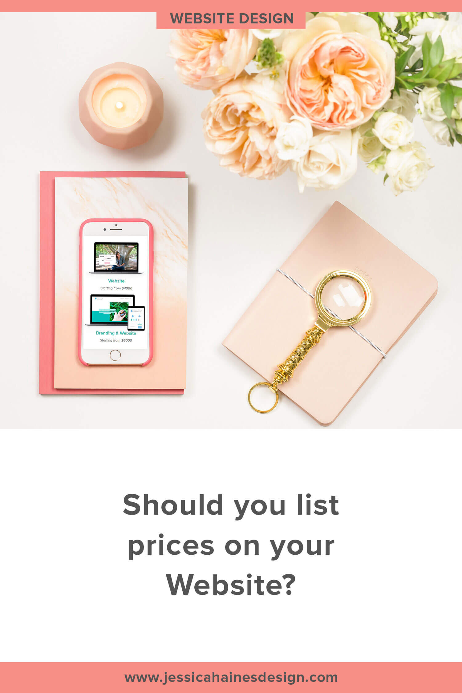
That moves us onto a controversial topic, and that’s whether or not to include prices on your website. Some benefits of prices:
It helps screen out people who aren’t serious about investing
If you don’t have prices, people often assume you’re too expensive
It makes things harder for your reader, which could drive them elsewhere
It saves back and forth in emails to see if you’re a good fit
The price conversation is less awkward since they already know the price
Personally, I’m #ProPrices, but some people prefer to speak to as many people on a call and sell that way instead. If you need help deciding which is the right fit for you, this post weighs in more on the price/no price debate (and shows how you can test both so you know which works best for you!)
Have you shown your dream clients how you are different to other people who do what you do? There might be hundreds of other coaches that do what you do, so why should your dream client choose you? Do you only work with a particular type of client? Do you run your sessions in a different format? Is your signature offer set up in a different format? You can use these differences to your advantage to help you stand out
The end of your service page is a great opportunity to add an FAQ section with common questions you receive and objections positioned as questions. It saves the back-and-forth emails, and is a better experience for your reader since they don’t need to wait for a response from you, plus it can help bust the objections someone has before they even speak with you
The most important part of the page is your call to action. This is the next step you want someone to take to work with you, and you want to make it as easy as possible for your reader so it’s a no brainer for them to reach out. Want them to schedule a call? Add your scheduler to the page. Want them to fill in a form? Have it there ready to go. The less steps there are to take the action, the more likely it is people will do it!

Is your website booking you clients while you sleep?
This free website audit checklist will show you what’s working on your website (and what’s not!) so you’ll know exactly what updates to make to help you grow your leads and bookings on autopilot.
Design Tips for creating a kickass service page
Successful services pages tend to be a bit on the longer side, but if you cover the points above, you’re setting yourself up for more people reaching out to you. And that’s the whole point, right?
Getting the copy written for your service page is only one part of the process though.
Let’s dive in to how to design the page so that your readers actually read it.
You could have the best copy in the world, but if you just have one massive block of text on the page, no one will read it!
Here are some tips on how you can design your page so it actually gets read:
The best performing service pages tend to be on the longer side. Breaking it into sections will keep your reader moving down the page and will keep it interesting. You can do this with colour-blocked sections, images, divider lines, etc to create a flow down the page
Use calls to action multiple times throughout the page. Not everyone will want to read the whole page, and if you do a good job connecting emotionally, they may want to jump in and take action right away. Don’t make the skimmers read the whole page, make it easy for them to take action by adding call to action buttons with the next step throughout the page (generally every 2-3 sections). And I just mentioned buttons… Make sure you use them for your calls to action since they stand out more and will naturally get more clicks
Format your text to break it up. Using headings, bullet points, bold and italics can really make a difference in how readable the page is!
Use images. We’re visual creatures, so images will draw in your readers and make it easier to show what you do than just text. Maybe you use workbook mock-ups or illustrations or photos of you doing your thing or something else to match the words. I promise the page will be much more interesting from it!
Is there anything you can do to create a sense of urgency to drive action with your fence-sitters? For example, are you only taking bookings for a limited time, or a certain number of people, or you only have certain available dates? Make this clear on the page so people know to take action right away. In saying this, only do it if there is a genuine sense of urgency with what you do!
Stay focused on the purpose of the page through the design and copy. You don’t want to be linking off the page for any reason. After all, you go to all the trouble of getting someone onto the page, so you want to keep them there rather than sending them down an internet rabbit hole that they likely won’t return from
Write your copy first, then design your page around it. Your design is what will get people’s attention initially and will keep them moving through the page, but the words are what will sell your service. You don’t want to be cutting out important details or adding fluff to your copy just to make it fit into a template. Writing your website copy can be challenging enough without playing Tetris with it!
Service pages have so much missed potential! Taking the time to create a killer sales page really can make a difference between hearing crickets and money in the bank, and I want to have the most profitable website that you can!
What changes have you made to your service page recently? Let’s see it in the comments below!

Is your website booking you clients while you sleep?
This free website audit checklist will show you what’s working on your website (and what’s not!) so you’ll know exactly what updates to make to help you grow your leads and bookings on autopilot.