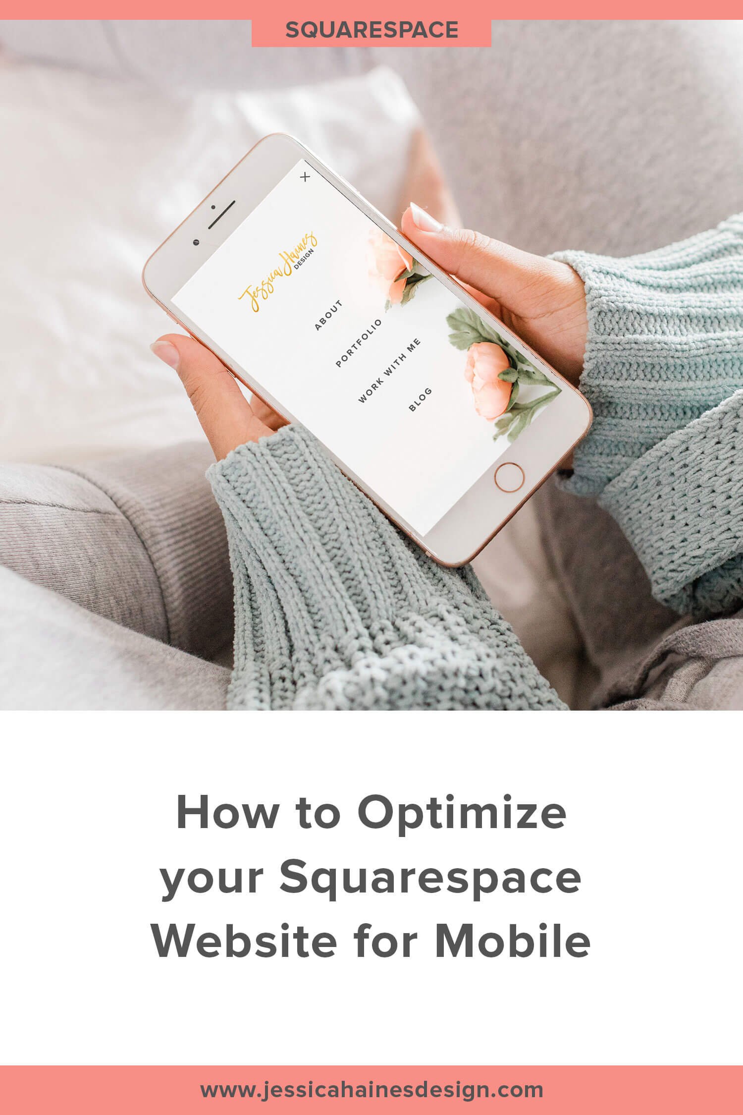
How to Optimize your Squarespace Website for Mobile
Getting started with Squarespace? Sign up for a free trial here and use the code PARTNER10 for 10% off your first year (Yep, that's an affiliate link!)
Have you ever visited one of your favourite websites on your phone only to find it’s not very user friendly on the smaller screen? I know I sure have! These days over half of all website views are from mobile phones, so it’s more important than ever to have your website looking great and functioning well on smaller screen sizes.
Not only do a huge amount of people view websites from their phone, but Google will penalize your website if it is not mobile friendly by reducing the number of searches your website appears in. This means that no only is the user experience on your website impacted, but you could lose out on the amount of traffic you get from Google searches.
So, what makes a website mobile friendly? One of the most notable features of a mobile friendly website is that the text can be read easily without having to pinch and zoom or rotate your screen. We all know how frustrating those websites can be! Also, spacing out links and buttons so they are easily clickable with your finger, and making sure your website is as speedy as possible will help keep people hanging around.
Squarespace templates are set up to be mobile responsive by default, so they will generally look ok on mobile, but there are still a few things you can do to make sure your website just as amazing on mobile as it is on your computer. This post will show you some of the updates you can make so the mobile experience is even better for your visitors.
Checking Mobile View
Squarespace makes it super easy to see how your website will look on smaller screen sizes. When you are on the page editor, you can click the little line at the top of the page editor to select either the phone or table icon so you can see how your website will look on those screen sizes.
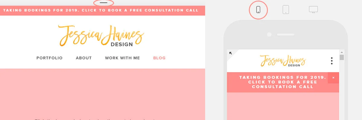
For every page you that you design, you want to scroll back through checking the mobile and tablet screen so you can can see how things look on the smaller screen sizes and make note of any updates you may want to make.
You want to pay particular attention to:
How content blocks stack, to ensure they are in the right order on mobile
The focal point of images to make sure they are cropped in the right place
Any large gaps on the page that look out of proportion on mobile
We’ll go through all of these in more detail below.
Stacked Blocks
When your website is viewed on a mobile, to account for the narrower screen, the content blocks on your page will change to a stacked view, rather than side-by-side to make sure everything on the page is still easy to read.
These blocks will stack vertically on your mobile, and may not always display in the order you want them to once they hit the smaller screen. Don’t worry, you can often rearrange your blocks to make them display how you want. Squarespace has a great 2 minute video on how this works in action here.
An example of how blocks might not stack correctly on mobile could be if you had 3 image blocks with text boxes directly below. The default would be for the blocks to stack vertically, so the 3 images would stack at the top with the 3 text boxes below.
If, however, the image is related to the text so you wanted them to display as image, text, image, text, image, text, you would need to link the text blocks to the corresponding images so they stack the way you want them to on mobile.
This is done by dragging the text box over the image so a black guideline appears between the blocks. This line tells Squarespace that these content blocks are related to to group them together. If you did this for all 3 images and text boxes, you would notice they then stack the way you want them to on smaller screens.
Focal Points on Images
When you are using an image on your website, it may end up cropped when viewing it on mobile. Squarespace will keep the center part of an image by default, but this isn’t always the most important part of the image that you want to see on mobile. This can also be an issue if you use text over a banner image, since the text may not show as clearly if it is over a busy part of the image.
To solve this problem, you can adjust the focal point of your images so that you are choosing the part of the image to focus on when it’s cropped for mobile viewing.
When you load the image settings, you will see a small circle on the screen. This is the focal point of the image. You can drag this focal point to where you want it to be on the image, which tells Squarespace that this is the main focus of the image. Just don’t forget to hit save before you exit the image settings!


Large gaps of Space between Content
If you’re looking at your website on your mobile, you may sometimes notice that you have too much space between the sections. This is generally because you have added a spacer block to add some extra room to a section, but it’s just way to much space on a smaller screen.
This one is a super easy fix, but it isn’t very well known. Since Squarespace doesn’t display spacer blocks that are next to other content blocks on mobiles, you can add 2 spacer blocks side-by-side and they will cancel each other out! This way, you still have the space you want when your website is viewed on a computer screen, but it looks great on mobile too!
Here you can see an example of a full width spacer block, compared to 2 spacer blocks that are side-by-side. The bottom ones will cancel each other out on mobile view.

Site Styles Settings
You want make sure things such as your fonts and colors look the way you want them to on mobile view as well. This is done through your Site Styles, which you can access from the main menu under Design > Site Styles.
As you scroll down, you will come to a section titled Mobile. This is the start of the mobile settings you can update. Each template may vary a little with the styles you can edit, but you can get an idea of some of the settings you may want to update below:
Mobile Breakpoint (this is the width at which your website will change to mobile view)
Whether you want the top bar that has your logo to be fixed at the top or not
The background colour behind your logo or site title
The size of your logo
The font and colour of your site title (this only shows if you don’t have a logo uploaded)
The position of your main navigation and way you want it to look, eg 3 lines stacked or a plus sign
The colour of the menu icon
Whether you have a search bar in your navigation or not, and what colour it should be
If you sell products, where the cart icon should be and how it will display
What the navigation looks like when you click it (eg fonts and colours)
How much space is between the navigation links
These styles are easy to miss if you’re not taking the time to set them up, but making the effort to spend a few minutes updating them will make your website look a whole lot more on brand and cohesive on mobile!
Website Speed
When you are browsing the internet on your phone, you will be likely be on a slower internet connection than what your computer will get, so website speed is even more important for mobile browsing.
As website visitors, we don’t like slow websites and will often click away if a website takes more than a few seconds to load. Google also doesn’t like slow websites, and will show your website lower in search results if it takes too long to load.
Some tips that can keep your website super speedy are:
Resize your images - They should be less than 500kb in size when you upload them. You can use websites like TinyPNG or JPEGMini to reduce the size so they load faster
Minimize the content on your pages - the more images, videos and content that you have on a page, the slower it will load
Remove unnecessary custom code and fonts to help speed your website up
AMP Browsing
AMP, or Accelerated Mobile Pages, is a setting you can turn on for your blog that will speed up the posts loading time by bringing up a lightweight version of your post. This means that page margins and fonts will adjust and some content blocks like calendars or summary blocks will not display on the post. This only happens if your blog post is accessed from a Google search, not for normal browsing.
The benefit of AMP is that your blog posts will load quicker for your visitor so they’re more likely to hang around and read it, but this also helps boost your SEO since Google prioritizes websites that load fast when displaying search results.
However, there are also some drawbacks. Any AMP pages that are accessed will not show in your Squarespace Analytics, so your analytics may not be completely accurate. Also, since some blocks don’t show, you may miss out on some benefits like people clicking through to related posts via a summary block, or if you have a newsletter block added via code, you may miss out on newsletter subscribers.
If you weigh up the pros and cons of using this setting and decide you want to turn it on, you can do this from the main menu in Squarespace by clicking Settings > Blogging and ensuring Accelerated Mobile Pages (AMP) is checked.
For the more Advanced User
If you still can’t get something to look the way you want and you’re familiar with a bit of code, Beatriz Carbello has an introduction to mobile coding video in her VIP library that you can watch by signing up for her free resource library.
This 20 minute video will walk you through how to use media queries to make changes to your website on smaller screen sizes, so you can have more control over how your customize your website.
She also has a paid training that will teach you how to avoid text blocks looking squashed on mobile, reduces image sizes on smaller screen, avoiding super narrow blocks and rearranging the order of blocks so they display the order you want on mobile. If you are interested in this, you can get the training here (this is an affiliate link and I may earn a small amount if you purchase. It doesn’t cost you any extra, and I’m sharing because Beatriz is the best at mobile optimization!).
One Last Tip
Now that we’ve gone through the ways you can make your website look even better on your phone, I want to share one last tip. There will likely be moments when you are trying to get something to look good on mobile, but in doing so, it starts to look terrible on the computer.
If you come across something like this, you’ll need to decide which platform you want to prioritize the look of. This is where Squarespace Analytics come in.
If you head to your Analytics tab and scroll down to the Visits by Device Type, you will be able to see what platform the people who visit your website are actually using, which will help you decide which platform to prioritize for the design.
Related Post: Squarespace Analytics Explained

When you are designing your website, it is well worth taking a bit of extra time to make sure your website looks great on mobile since you’re website will come across as more professional and polished to your visitors, which is a great way to build trust. You don’t want to risk turning away over half of your website visitors because you haven’t given any thought to how your website works on mobile devices!

Don’t want to have to do this yourself? I take care of all the tech stuff like this if you work with me, to make sure you have a website that looks beautiful no matter what screen someone views it on!


